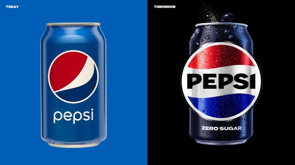
Pepsi, the iconic global brand, is unveiling a new logo and visual identity system, the first update of the iconic Pepsi globe logo in 14 years. Pepsi will roll out the new look in North America this fall in time for the brand’s 125th anniversary, and globally in 2024, marking the brand’s next era with an eye toward the future. The new design evolves the Pepsi brand to represent its most unapologetic and enjoyable qualities. It will span across all physical and digital touchpoints, including packaging, fountain and cooler equipment, fleet, fashion and dining. Pepsi plays a critical role in achieving the PepsiCo Positive sustainable packaging targets. In the U.S., as of 2022, Pepsi has begun to convert all 20oz bottles of Pepsi, including Pepsi Zero Sugar to 100% recycled PET. The new logo and visual identity pay homage to the brand’s rich heritage while taking a giant leap toward the future.
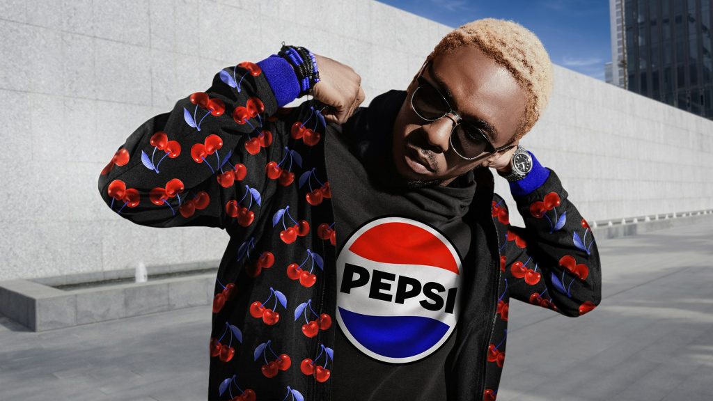
Throughout its storied history, Pepsi has maintained a bold challenger mindset and a strong link to pop culture. From the Pepsi Challenge and reimagining the Super Bowl Halftime Show, to creating some of the most iconic ads of all time with the world’s most renowned musicians and actors, Pepsi has always pushed the culture forward to deliver one-of-a-kind fan experiences in a timely way, while simultaneously remaining iconic and timeless. Pepsi also continuously reinvents itself with brave marketing and product innovation, from creating its own television shows, exploring Web3 and introducing compelling new varieties over the years including the recent Nitro Pepsi, Pepsi x Peeps, Pepsi for SodaStream and an improved Pepsi Zero Sugar taste in the U.S. to give fans the best tasting cola in the zero-sugar category.
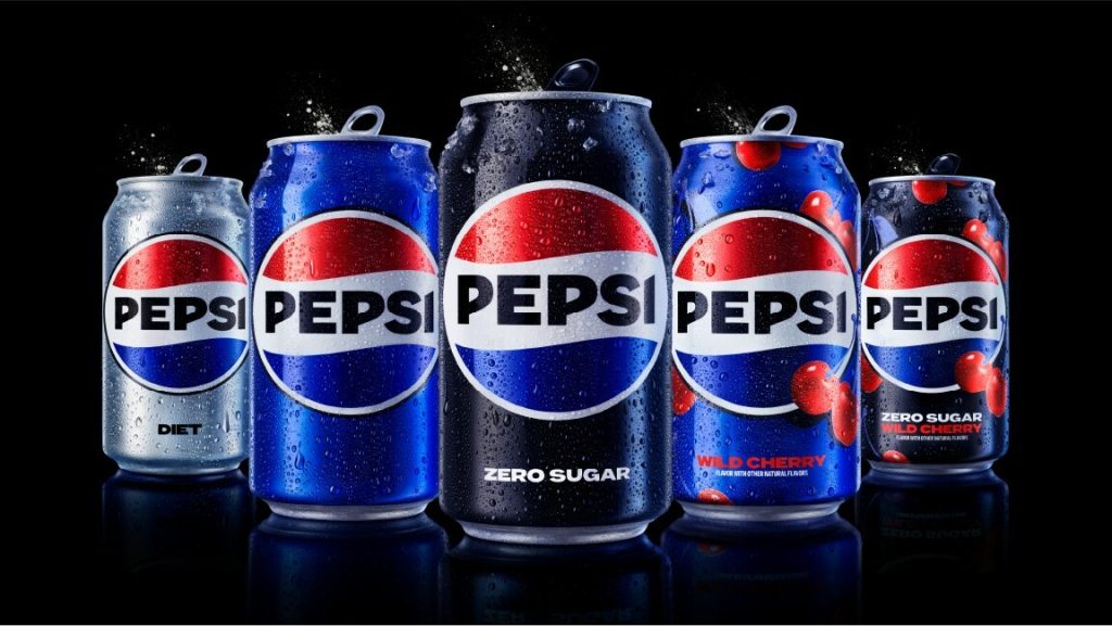
At its core, Pepsi is inspired by helping fans choose more moments of unapologetic enjoyment. In an increasingly digital world, the revitalized and distinct design introduces movement and animation into the visual system, unlocking more flexibility for Pepsi to move between physical and digital spaces, from retail shelves to the metaverse. It also allows for more seamless and creative collaboration with partners and retailers and more versatility to engage fans in the places they shop, dine, work and play.
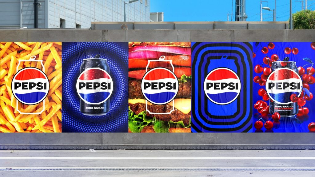
Key design elements include:
– The Pepsi globe and wordmark unite to fit into a variety of settings and emphasize the distinctive Pepsi branding.
– An updated color palette introduces electric blue and black to bring contrast, vibrancy, and a contemporary edge to the classic Pepsi color scheme. Given the brand’s continued focus on Pepsi Zero Sugar, the design brings in the color black, further showing the brand’s commitment to Pepsi Zero Sugar in the future.
– A new visually distinct can silhouette, which heroes the iconic Pepsi can as an accessible brand for all.
– A modern, custom typeface reflects the brand’s confidence and unapologetic mindset.
– The signature Pepsi pulse evokes the “ripple, pop and fizz” of Pepsi-Cola with movement. It also brings the rhythm and energy of music, an important and continuing part of the Pepsi legacy.
Fun Fact: The original Pepsi logo was designed by Caleb Bradham the chemist who created Pepsi. He used a scribbled logo script. The logo was changed more than 10 times. The current logo was designed in 2008 by the Arnell Group.
Discover more from Grubbits
Subscribe to get the latest posts sent to your email.

