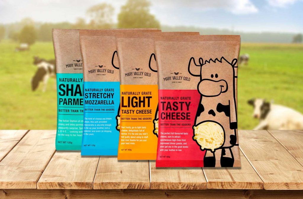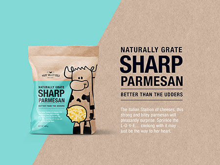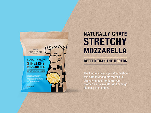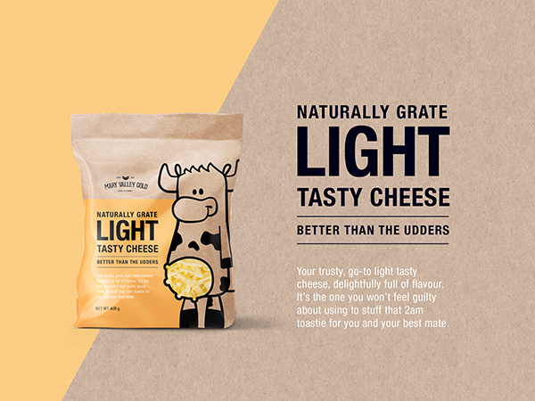
When it comes to cheese, there is not much one can do with packaging. I never had Mary Valley Gold grated cheese, I do not live down under but I fell in love with the cheese manufacturer’s clever yet subtle artwork. Very effective and to the point. It is good to see companies having fun with their brands.


Happy cows are the foundation of our company. The healthier and happier they are, the better their milk—simple as that. By using the highest quality sweet milk from our herd of free-range ladies, we have created award-winning cheeses that proudly stand up against all leading competitors.


The package design was created by Graphic Design Australia and they shared their enthusiasm about the project. It is contagious when you are involved with a project such as this. It is more than Photoshop, it’s a project that embellishes happiness from paper to final packaging. It must be high to see your packaging in retail stores. What an achievement, well done guys!
The Mary Valley Gold cheese range has been one of our funniest projects yet. Our aim for the brand was to give it personality and be appealing to both kids as well as mum (who was most likely doing the shopping for the family). We felt everything on the shelf looked the same and lacked the personality to be noticed. Giving the cows personalities was one avenue we took to be memorable and create conversations. Puns were another 🙂
Discover more from Grubbits
Subscribe to get the latest posts sent to your email.
