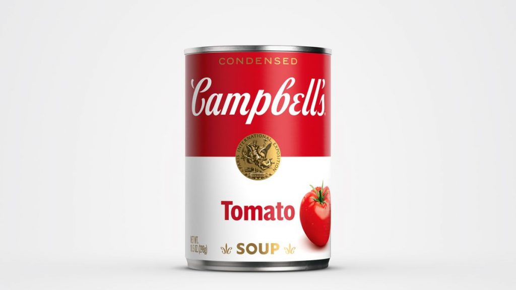
The Campbell’s soup can is a universal testament to one of the most essential achievements in the food industry. It is considered a North American food staple that has stood the test of time. If the stock market plummets, there is a good chance that Campbell’s stock is still doing well. It is a constant in our lives. Week after week you will see this lonely product go up and down in price in your local store flyers. You have to marvel at the simplicity of the can design that has not changed over 100 years.
Andy Warhol made it a darling in the art world. This soup sustains many minds and souls. The label design has had a few minor changes throughout the years, but it remains steadily the same since its inception. With or without Warhol, it is a thing of simplistic beauty no matter what. But what is behind the label that is etched in our minds each day we make a trip to the grocery store?

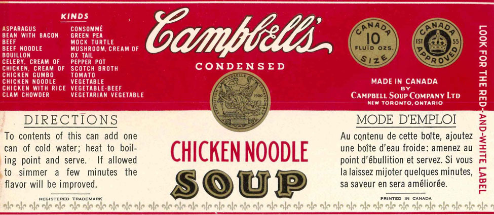
1. Red and white color scheme: The original labels for Campbell’s flagship condensed soup line, created in 1897, were actually orange and blue. A year later, the scheme changed to red and white after Herberton L. Williams, the company’s treasurer and general manager, saw a University of Pennsylvania versus Cornell football game, in which he was impressed by Cornell’s red and white uniforms and proposed the change.
2. Classic Campbell’s script: Thought to be inspired by founder Joseph Campbell’s own signature, the cursive “Campbell’s” logo was intended to lend a homemade feel to the label that would appeal to housewives.
3. Medallion: The center medallion existed in several versions between 1898 and 1900, after which it was modeled after a medal the company received at the 1900 Paris Exposition Universelle and maintained as a longstanding symbol of its excellence.
The Fleur-de-lis: The first labels featured fleur-de-lis symbols. The thinking? To show people that while Campbell’s was an American product, Campbell’s used the highest quality French cooking methods to prepare their soups.
In 1962, Andy Warhol produced “Campbell’s Soup Cans”: 32 paintings, each representing a flavor of Campbell’s condensed soup. “With these works, Warhol took on the tradition of still-life painting, declaring a familiar household brand of packaged food a legitimate subject in the age of Post-War economic recovery,” according to Christie’s.

Fun Facts: Campbell Kids are “born” when a Philadelphia artist, Grace Dayton, sketches them for a series of streetcar advertisements in 1904.
In 1934, Campbell’s Noodle with Chicken and Cream of Mushroom soups. Noodle with Chicken became Chicken Noodle after a radio announcer misread an ad for the soup and the name stuck.
Discover more from Grubbits
Subscribe to get the latest posts sent to your email.
