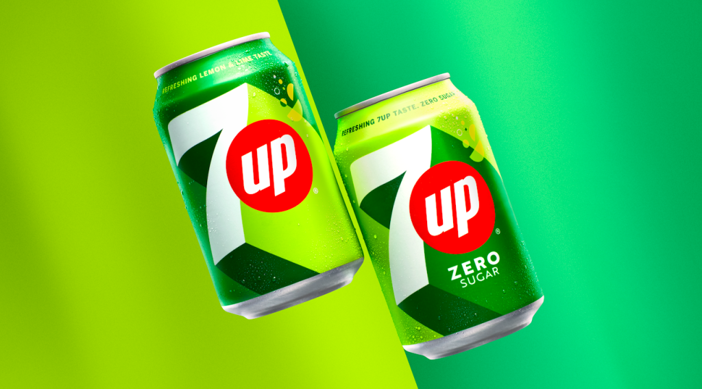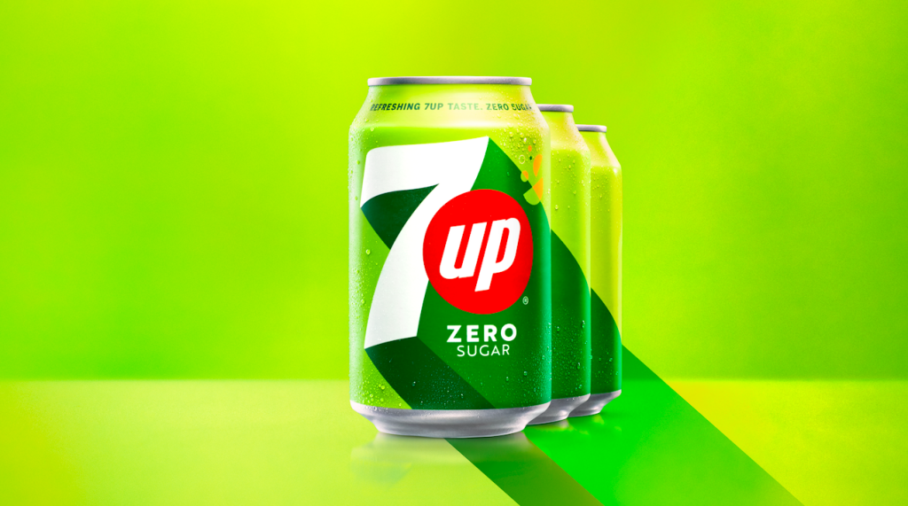
7-Up has a new look. It is rad! The simple long drop shadows are brilliant and powerful.
At the core of the new identity by PepsiCo Design + Innovation is the brand’s aim to offer slight relief from the more mundane parts of life, something the brand calls “UPliftment.” Visually, they accomplish this with 7UP’s signature green color serving as a base punctuated with zesty splashes of citrus-inspired hues. Long drop shadows add excitement to the packaging, and core elements like the red spot are retained but modernized. The can design gets simplified without losing depth and includes thoughtful details like circular shapes reminiscent of lemon and lime wedges and empty circles like bubbles in 7UP. (Rudy Sanchez)

Fun Fact: The original formulation contained lithium citrate, which was used in various patent medicines to improve moods. It has been used for many decades to treat manic-depression. It was popular to go to lithium-containing springs such as Lithia Springs, Georgia, or Ashland, Oregon for this effect. It contained lithium until 1948.
Discover more from Grubbits
Subscribe to get the latest posts sent to your email.
